“Beehive Extracts”
Winter 2021
Project OverviewWhat began as a creative passion project during winter break ultimately evolved into a definitive, real-world freelance opportunity. Beehive is a premium THC extraction company that works in close partnership with local craft cannabis cultivators. After receiving some of the brand's original merchandise from friends inside the company, I was inspired to redesign their visual identity as a personal creative exercise.
My goal was to elevate their existing identity by crafting a standout visual system that emphasizes the brand's core values: purity, safety, and a thoughtful, modern consumer experience. In the spring of 2022, I pitched this comprehensive rebrand directly to the founders of Beehive. Impressed by the strategic direction, the owners are now working to transition this conceptual project into their official, real-world brand identity.

The Design ChallengeThe cannabis and concentrates market is highly saturated, often relying on predictable design tropes. The challenge was to break away from these industry clichés and position Beehive as a highly trusted, sophisticated brand. The visual language needed to appeal to discerning consumers by communicating a meticulous extraction process, absolute product cleanliness, and clinical safety—all while retaining the organic, communal warmth implied by the name "Beehive."
Logo Marks & Typography
The updated visual identity centers around a refined, geometric mark that subtly bridges the organic structure of a honeycomb with the clean, precise lines of modern laboratory equipment.

Primary Logo
A balanced, high-impact mark designed for strong readability across small-scale applications, such as vape cartridges and concentrate jar lids.
A balanced, high-impact mark designed for strong readability across small-scale applications, such as vape cartridges and concentrate jar lids.

Secondary Mark
Flexible alternative layouts that allow the brand to adapt seamlessly to various merchandise footprints, regulatory warning labels, and digital platforms.


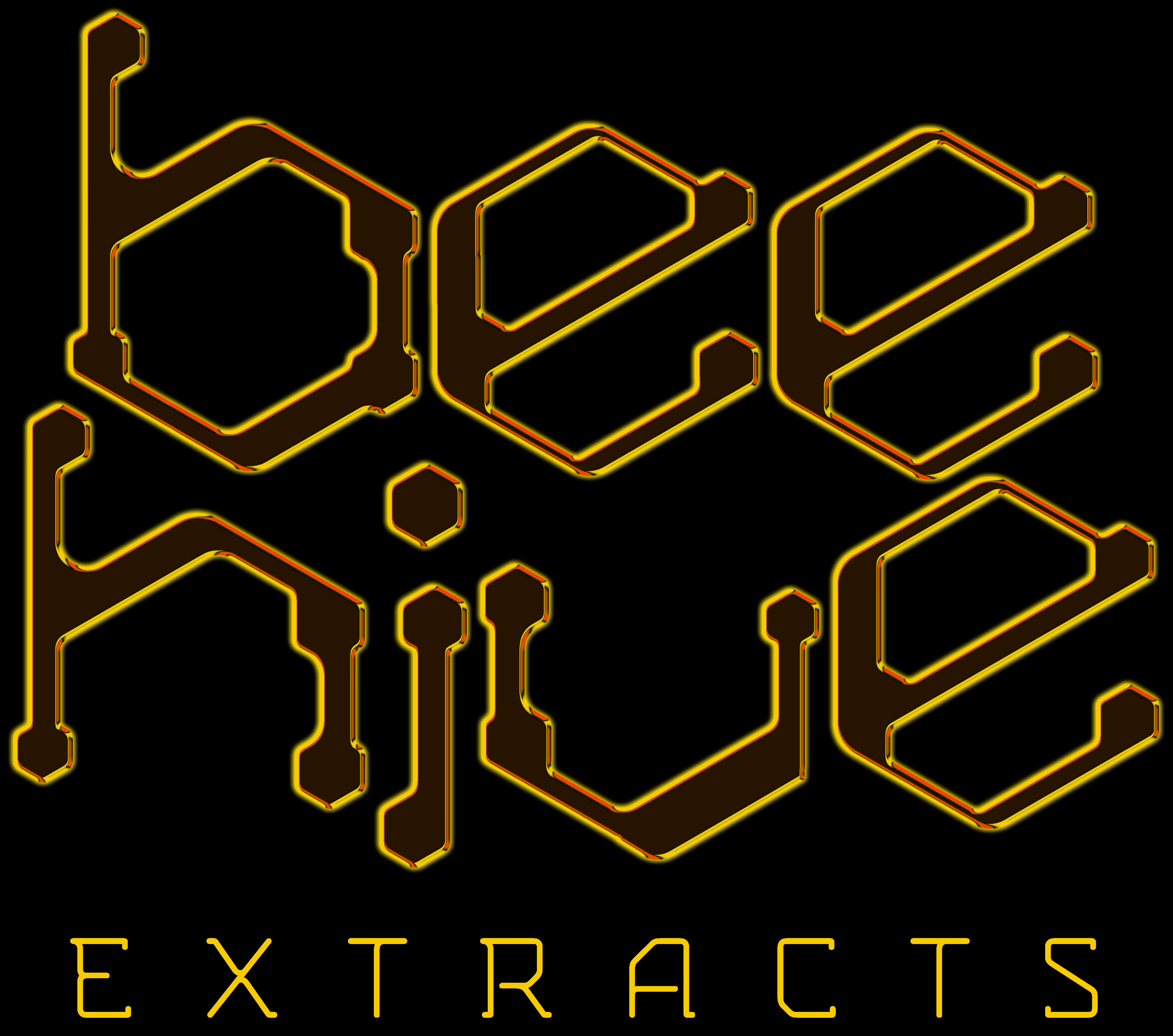


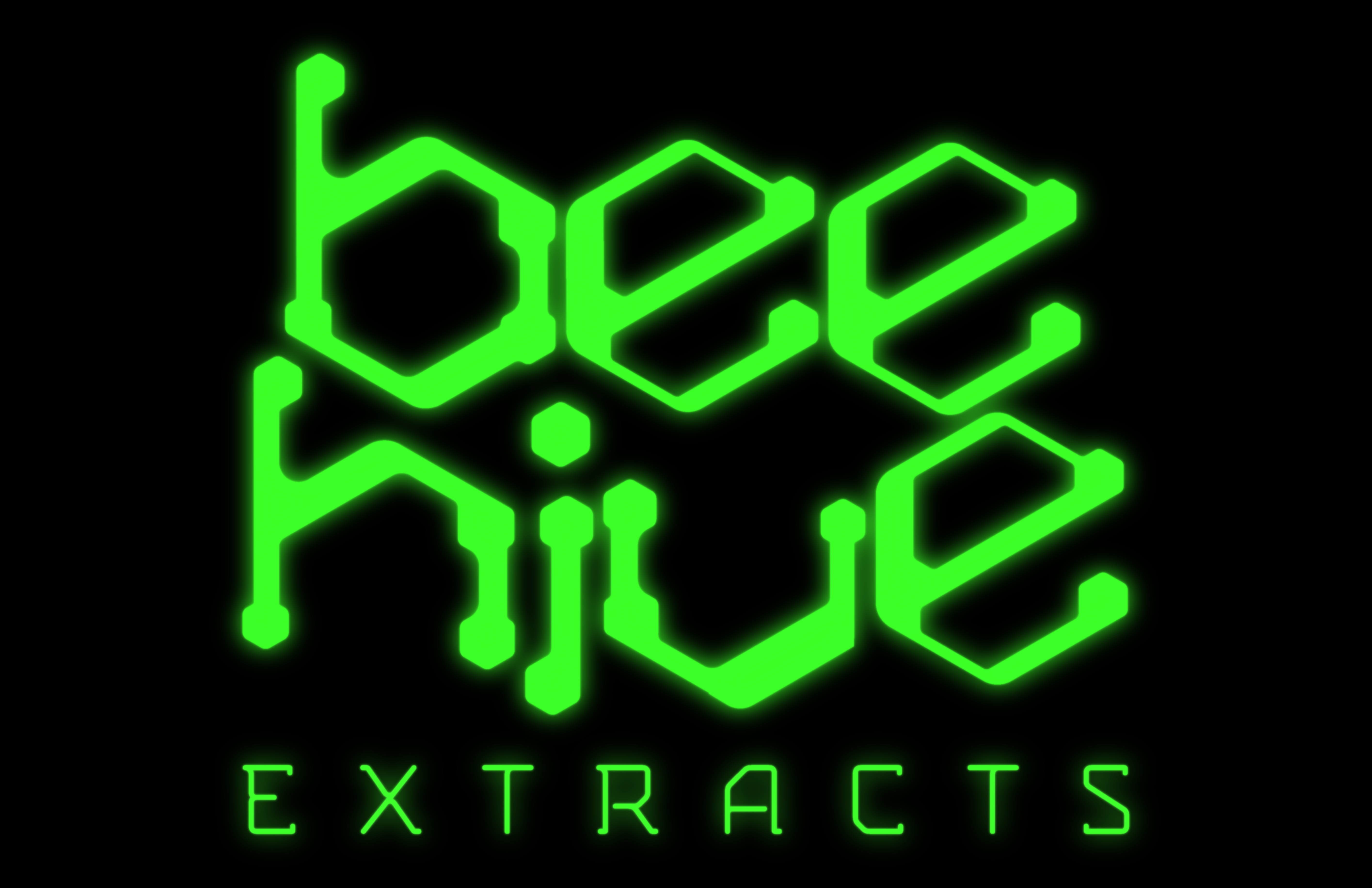
Further iterations for the different companies that Beehive collaborates with.
![]()
Each Iteration would have their own color/effect treatment.
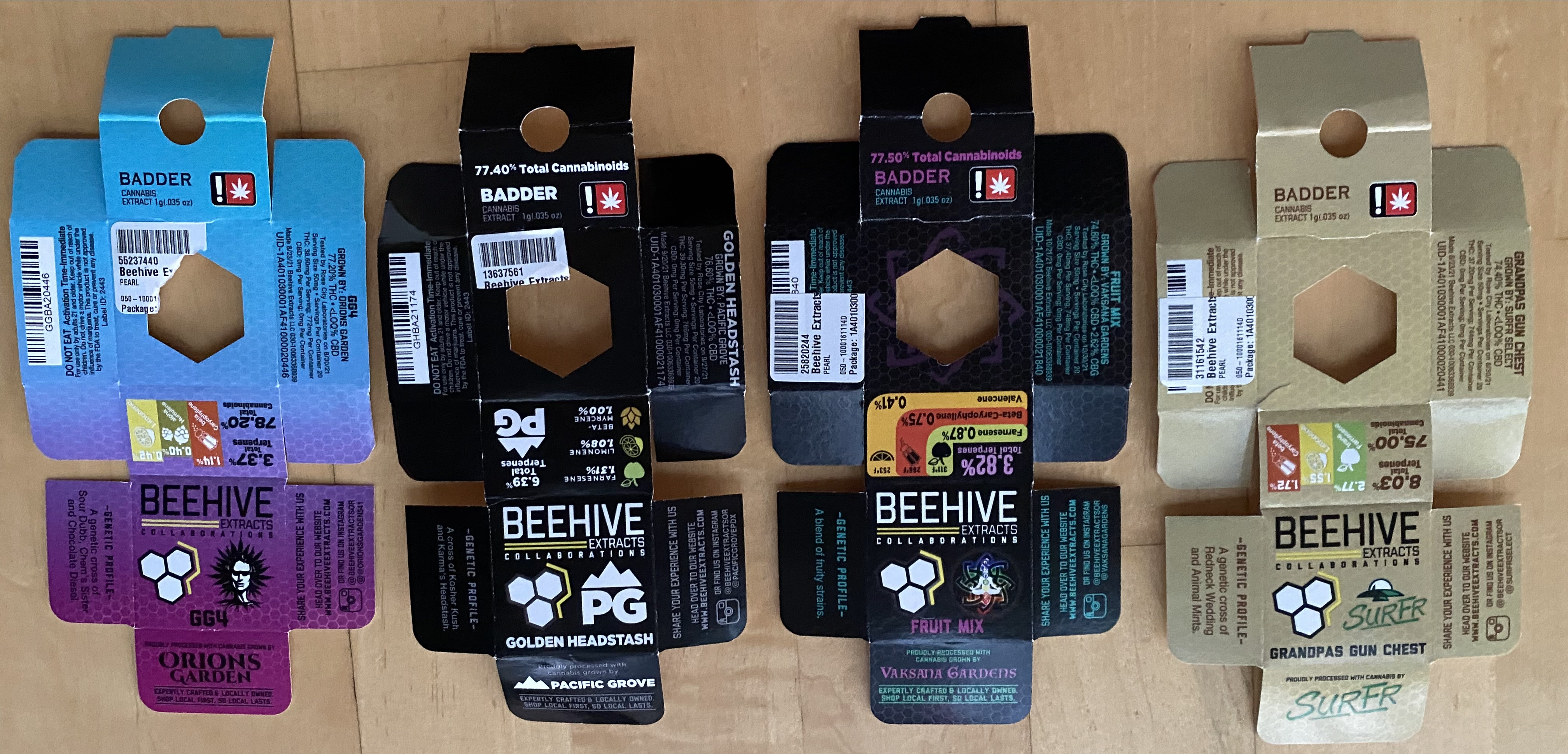
Each Iteration would have their own color/effect treatment.
Packaging & Compliance Concepts
In the extraction industry, packaging is a critical touchpoint. I developed a clean, minimalist packaging concept that utilizes bold typographic hierarchy and structured layouts. This design approach ensures that critical product information—such as strain types, THC percentages, and safety compliance data is effortlessly legible while maintaining a premium, shelf-ready aesthetic that commands attention.
 Some math and a sketch to determine how much total space was used on the original packaging so I could follow that blueprint.

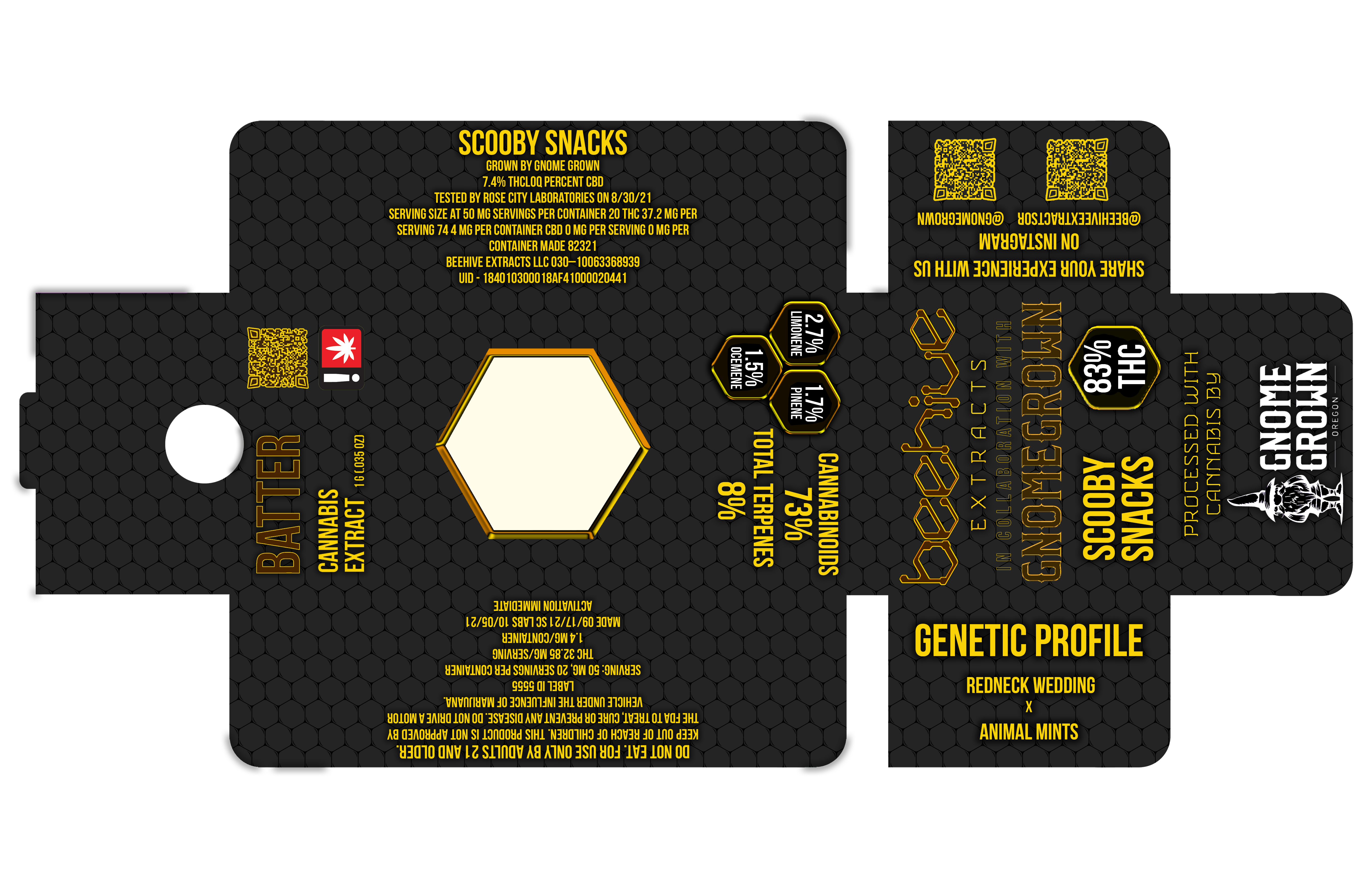


Rebranded Packaging


