“IUGO”
Spring 2022
Project OverviewDeeply inspired by the unmatched efficiency, legendary precision, and cultural impact of Japan’s Shinkansen (bullet train), I wanted to conceptualize what a high-speed transportation revolution could look like within the unique geographic landscape of the United States. The result is IUGO—a speculative Hyperloop brand engineered to interconnect every major American city.
The name is derived from the Latin verb iugo, meaning "to bind together, connect, or couple." This etymological root perfectly encapsulates the core mission and values of the brand: shrinking vast geographic divides and uniting a continent through seamless, human-centered technology. Rather than presenting a cold, sterile corporate vision of future transit, the branding for IUGO was built to feel approachable, highly organized, and emotionally grounding.
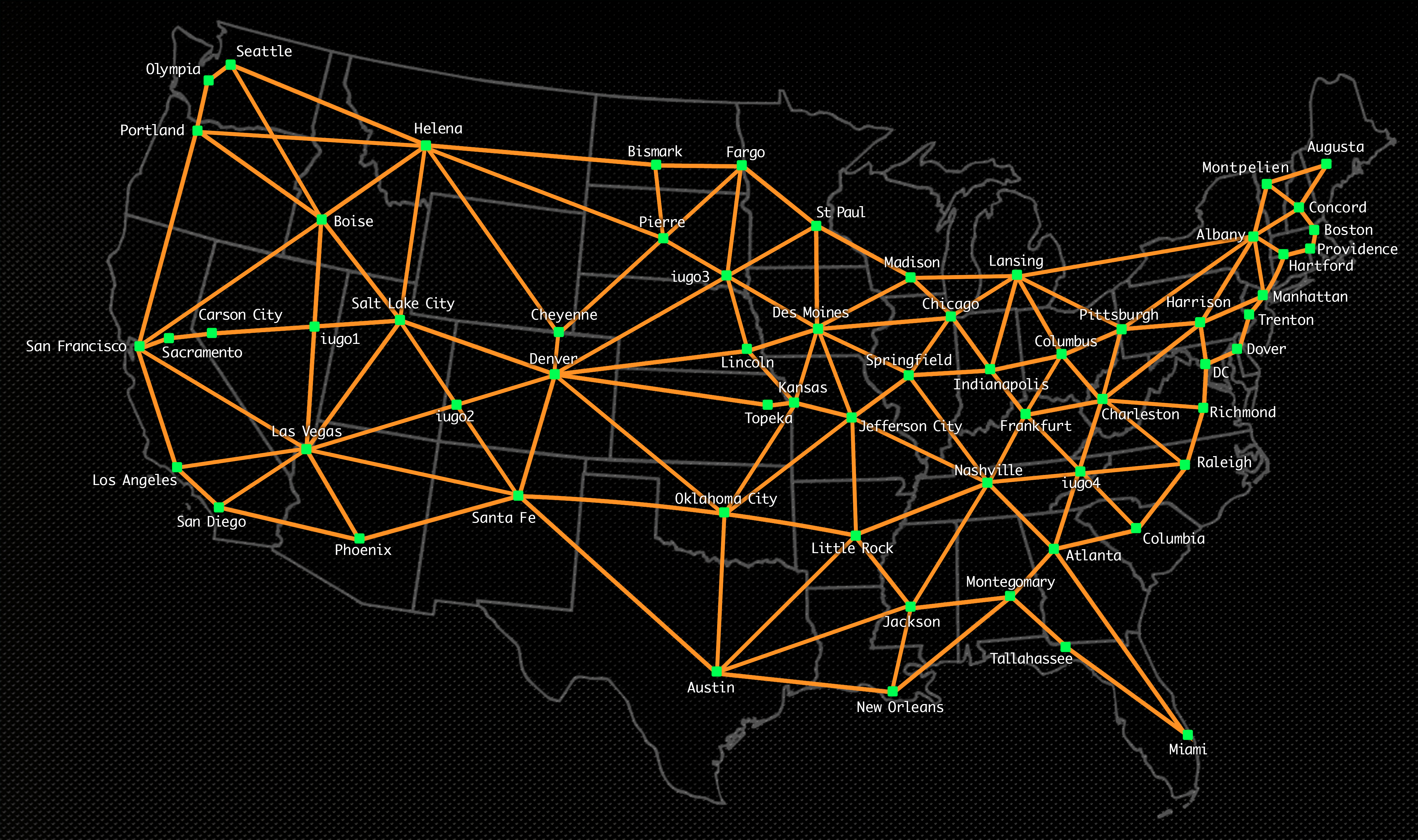
Train MapTo establish the sheer scale and believability of the network, I designed a comprehensive, interconnected transit map. Balancing complex spatial data with clean, minimalist line work, the map serves a dual purpose: it acts as a functional navigation tool while visually demonstrating how a hyperloop system can effectively unify the vast distances between American metropolises into a singular, cohesive grid.
LogosThe logo for IUGO required a careful balance of motion, structural integrity, and timeless typography. The visual language needed to communicate extreme velocity while maintaining an authoritative sense of safety and reliability.

Logo v1explores a more fluid, dynamic approach to the letterforms, emphasizing the swift, uninterrupted flow of a capsule passing through a hyperloop tube.
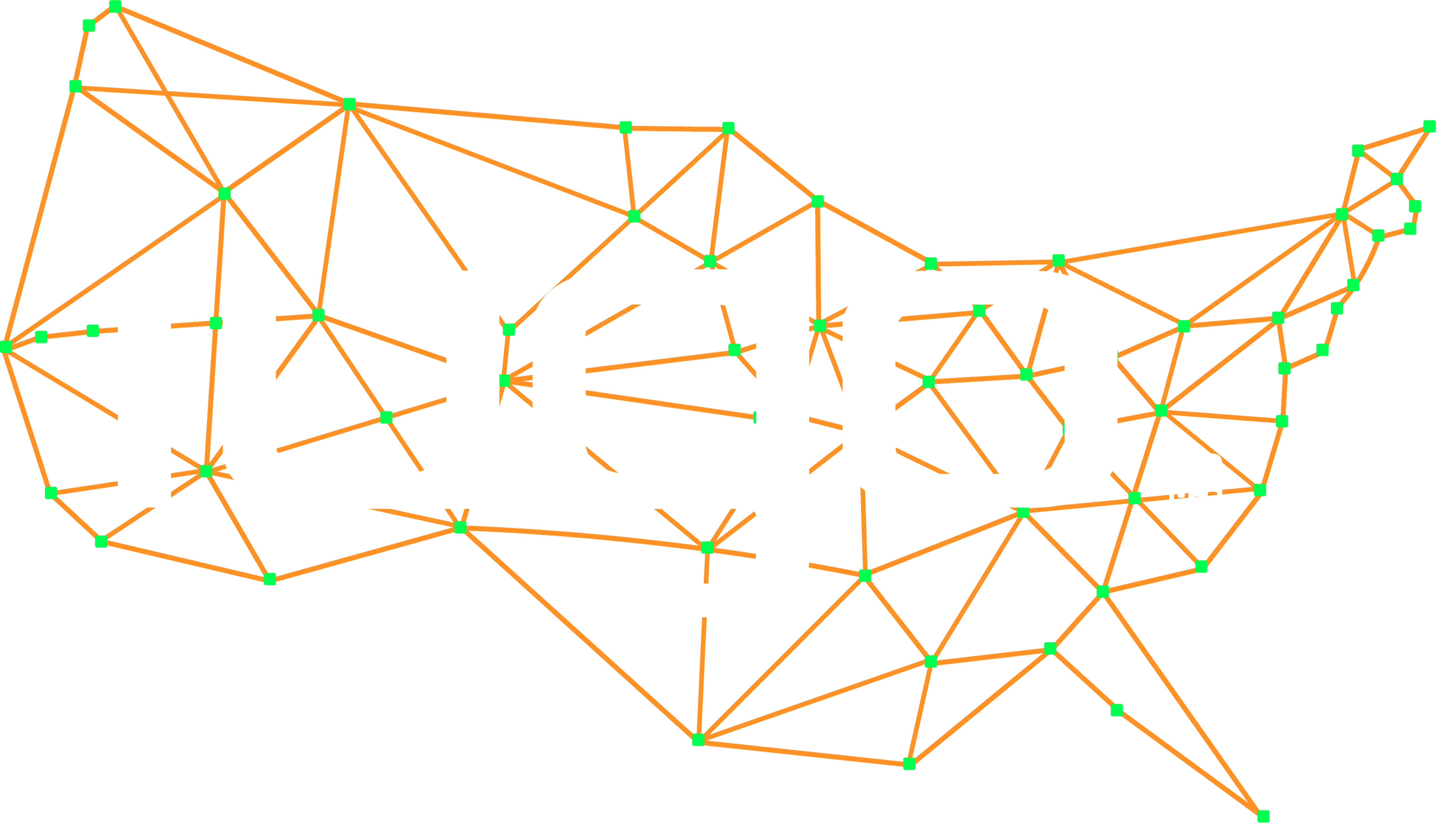
Logo v2leans into a more structural, locked-in geometric alignment, directly mirroring the literal meaning of the name: a system where disparate nodes are coupled and bound tightly together.
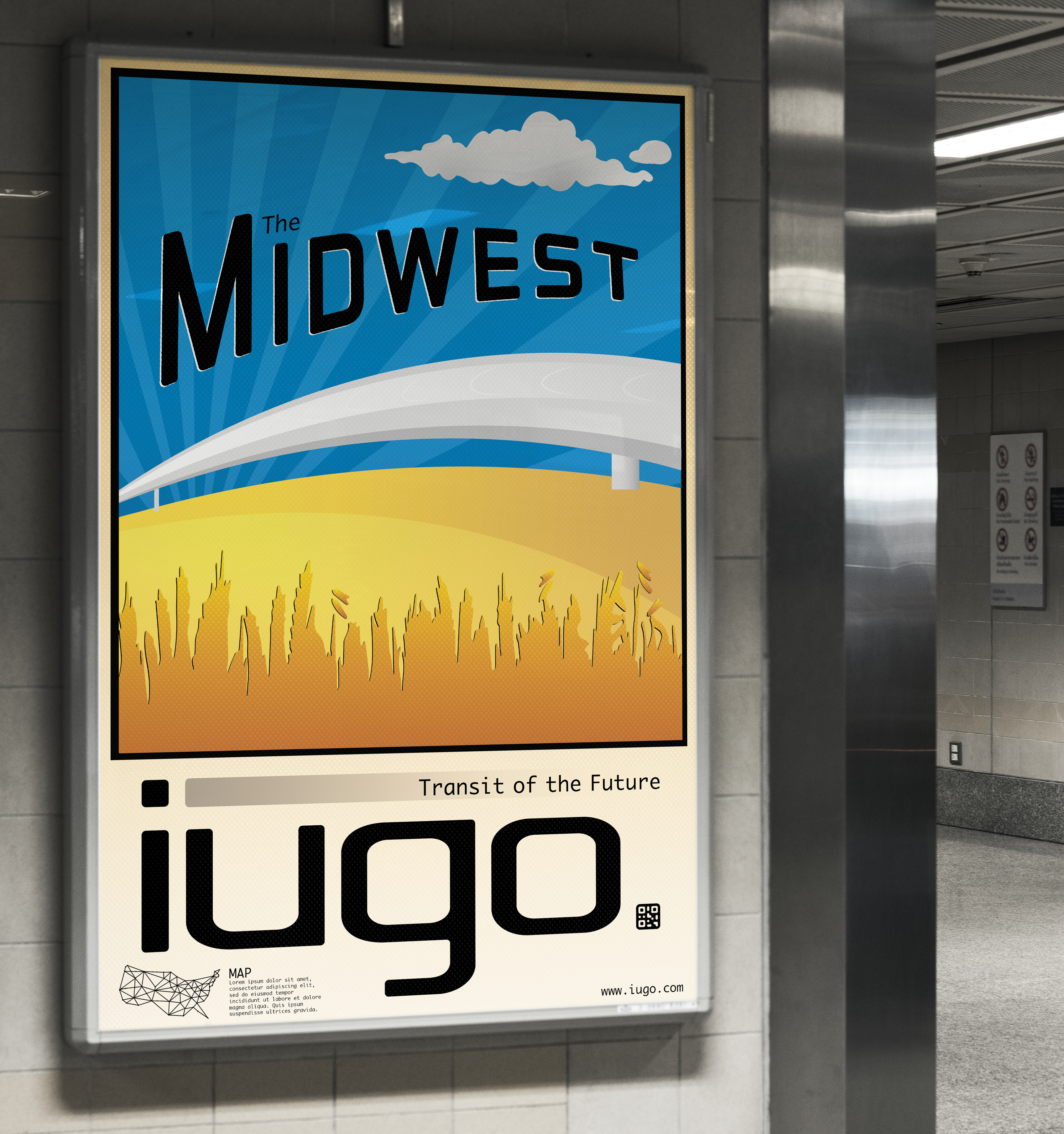
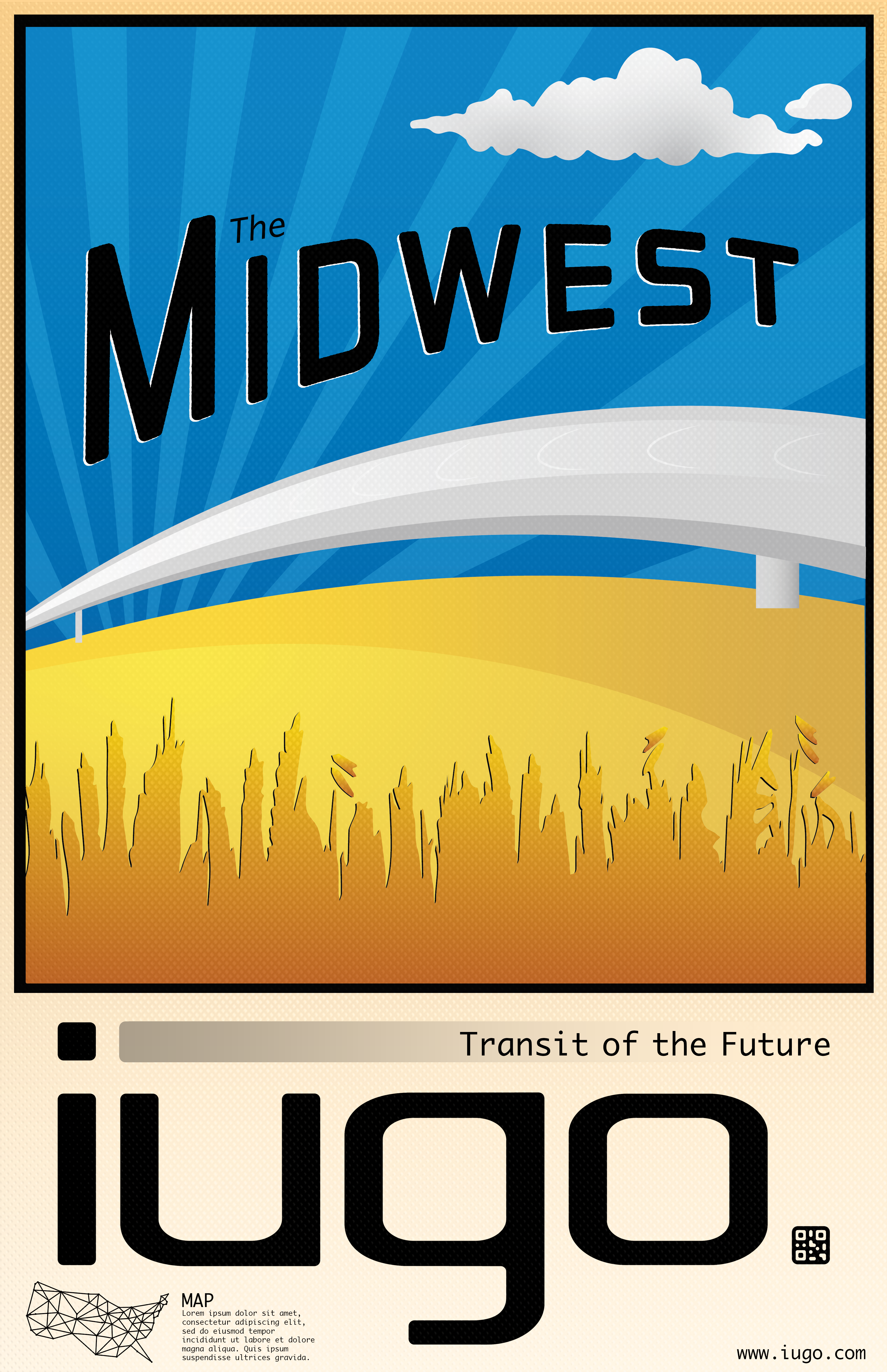
PosterTransit branding is deeply rooted in environmental graphic design. I created a poster series to introduce this revolutionary transit method to the public in different regions. These posters serve as the brand's primary storytelling voice, bridging nostalgic, golden-age travel art with sleek, futuristic typography to build public excitement and cultural pride around the network.
AI Mockups
To bring the project fully into reality, I utilized AI mockup tools to simulate how the poster series and visual assets would live in the physical world. These mockups show the brand operating in high-volume, real-world environments—demonstrating how IUGO’s clean, high-impact aesthetic cuts through the noise of modern transit.


